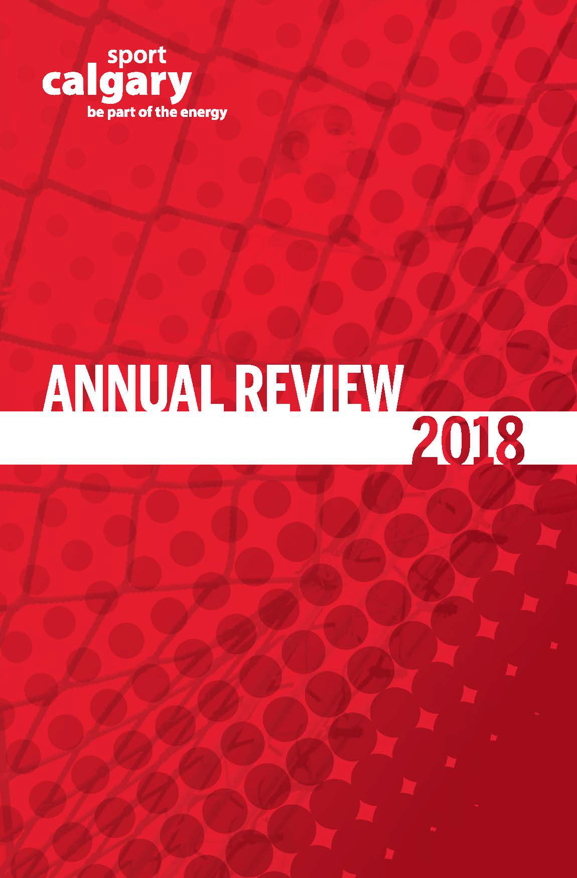
Annual Review 2018


Annual Review 2019


Case Summary
During my time at Sport Calgary, I was responsible for creating the designs of the Sport Calgary Annual Review from 2018-2020.
With copywriting assistance from colleague David Benson, I compiled together the final layouts of the Sport Calgary Annual Reviews you see below.
The 2018 Annual Review was a completely new design created from scratch and 2019 was repurposed to suit the visual and written content needs of that year.
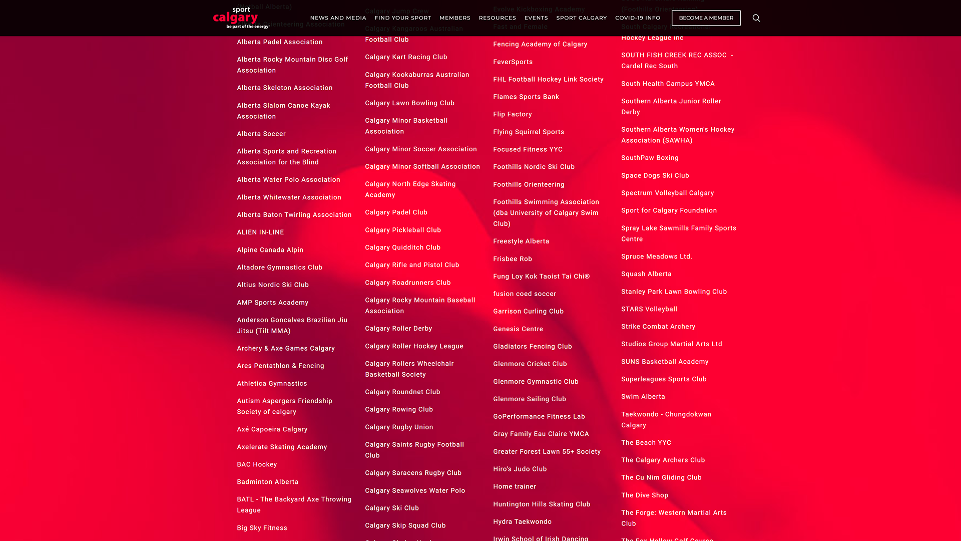
For printing-related purposes, we kept the total number of pages to increments of 4.
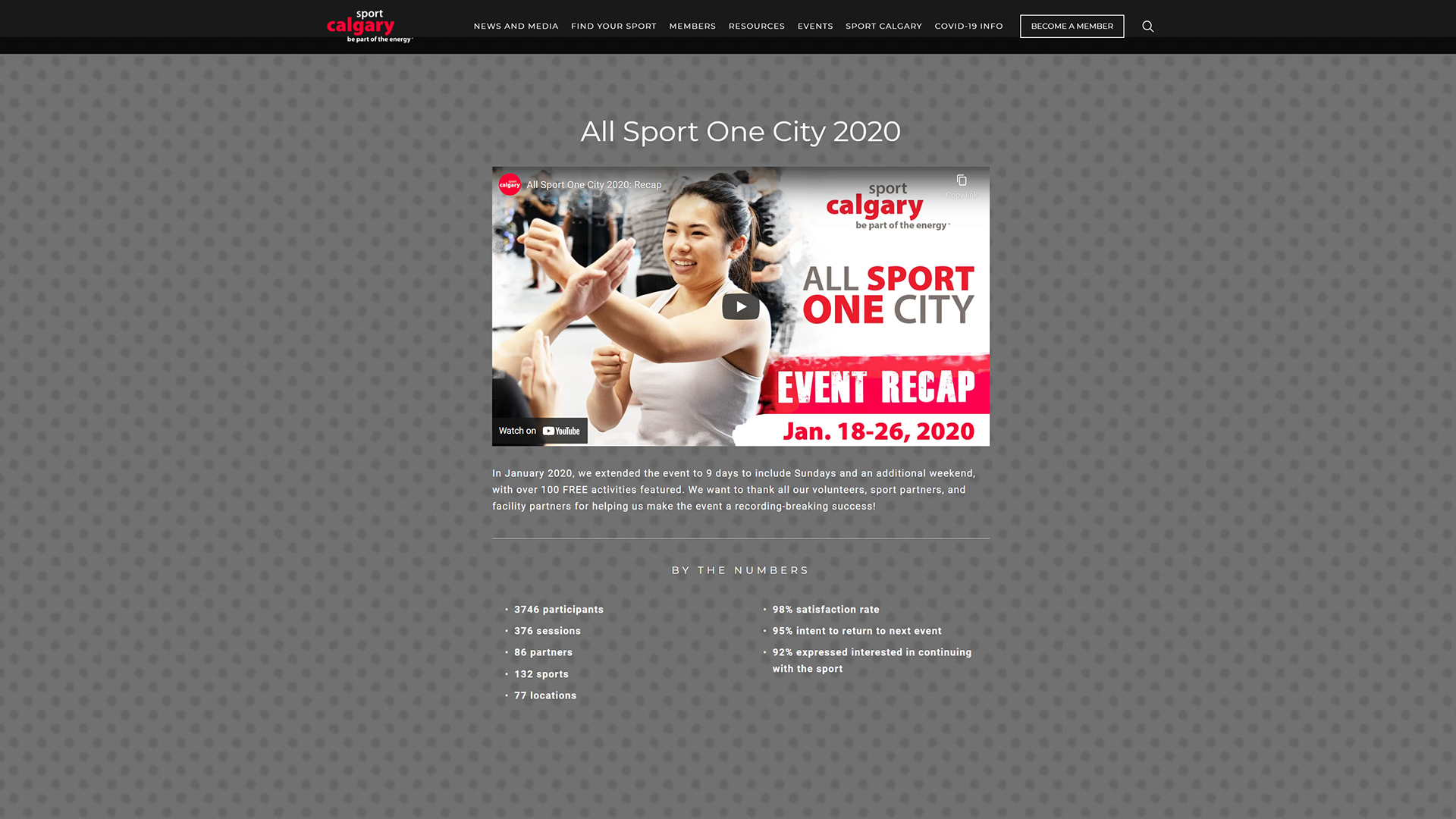
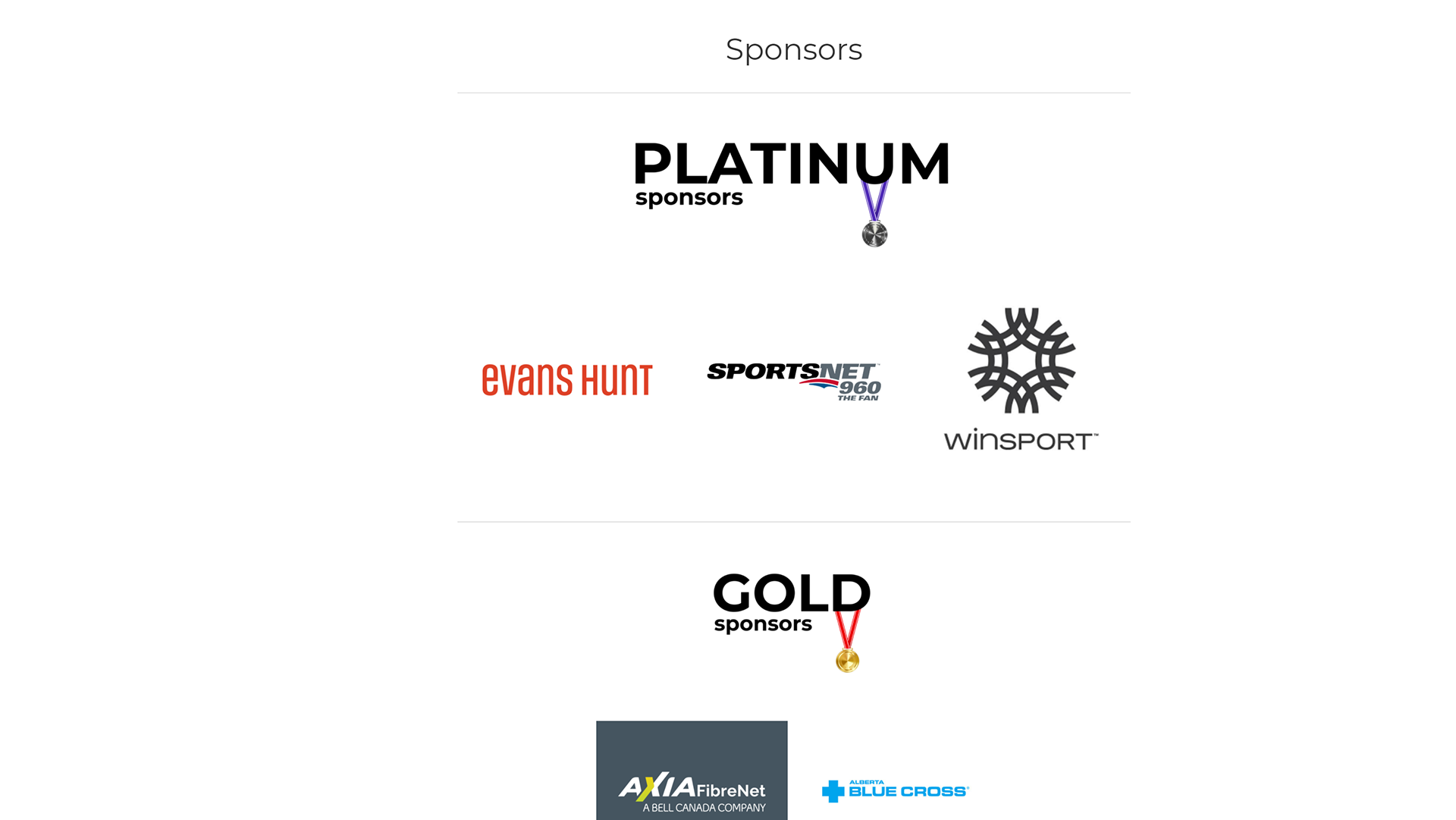
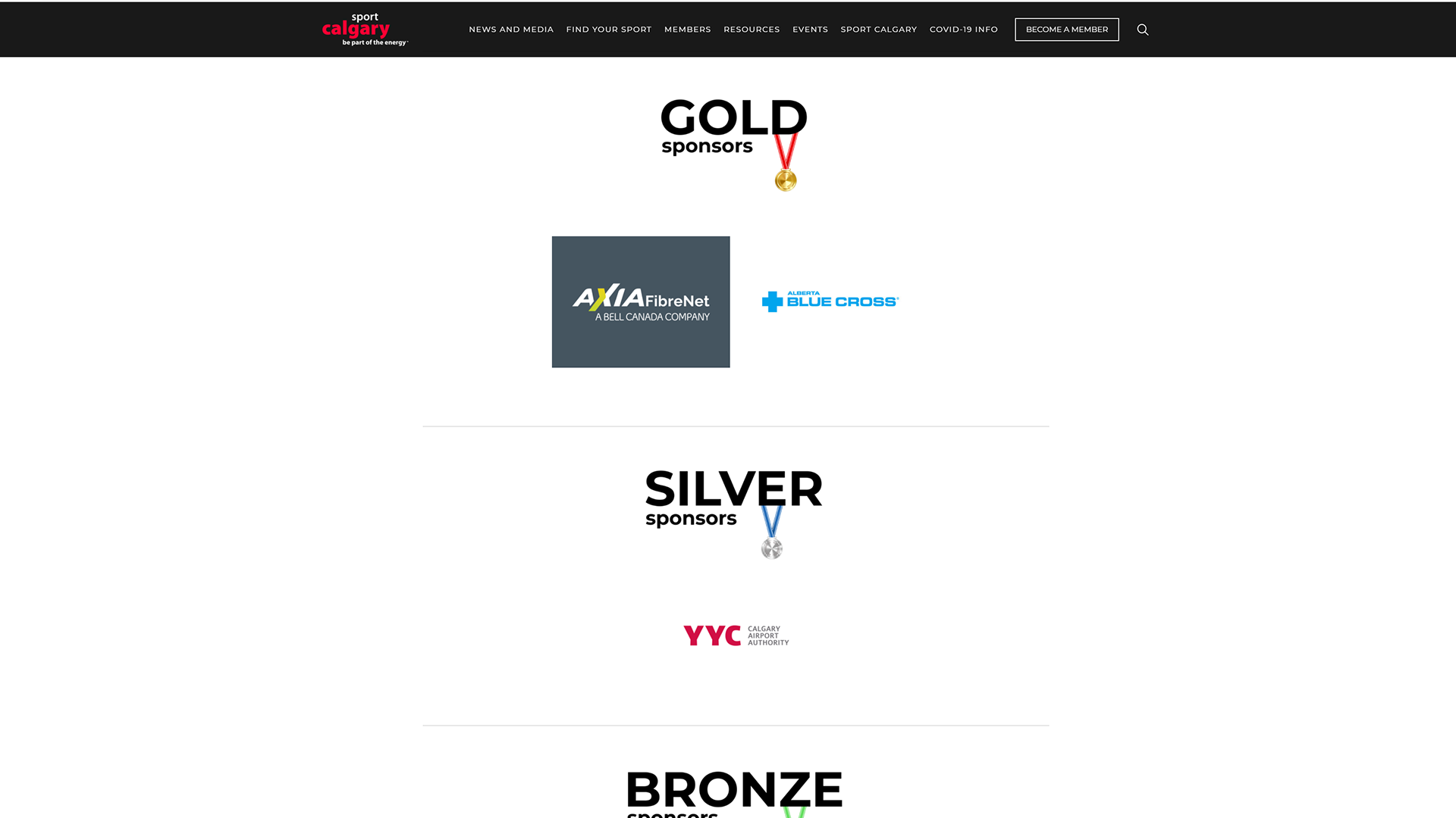
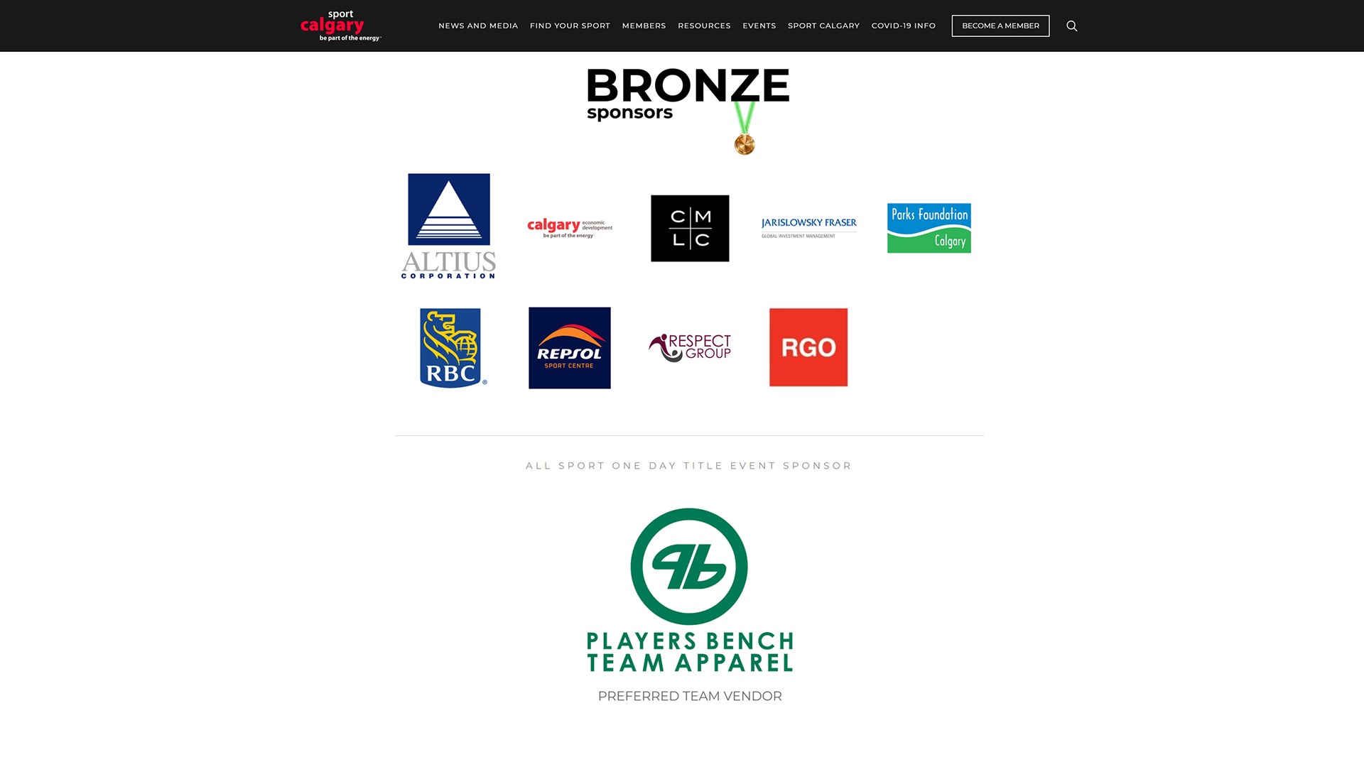
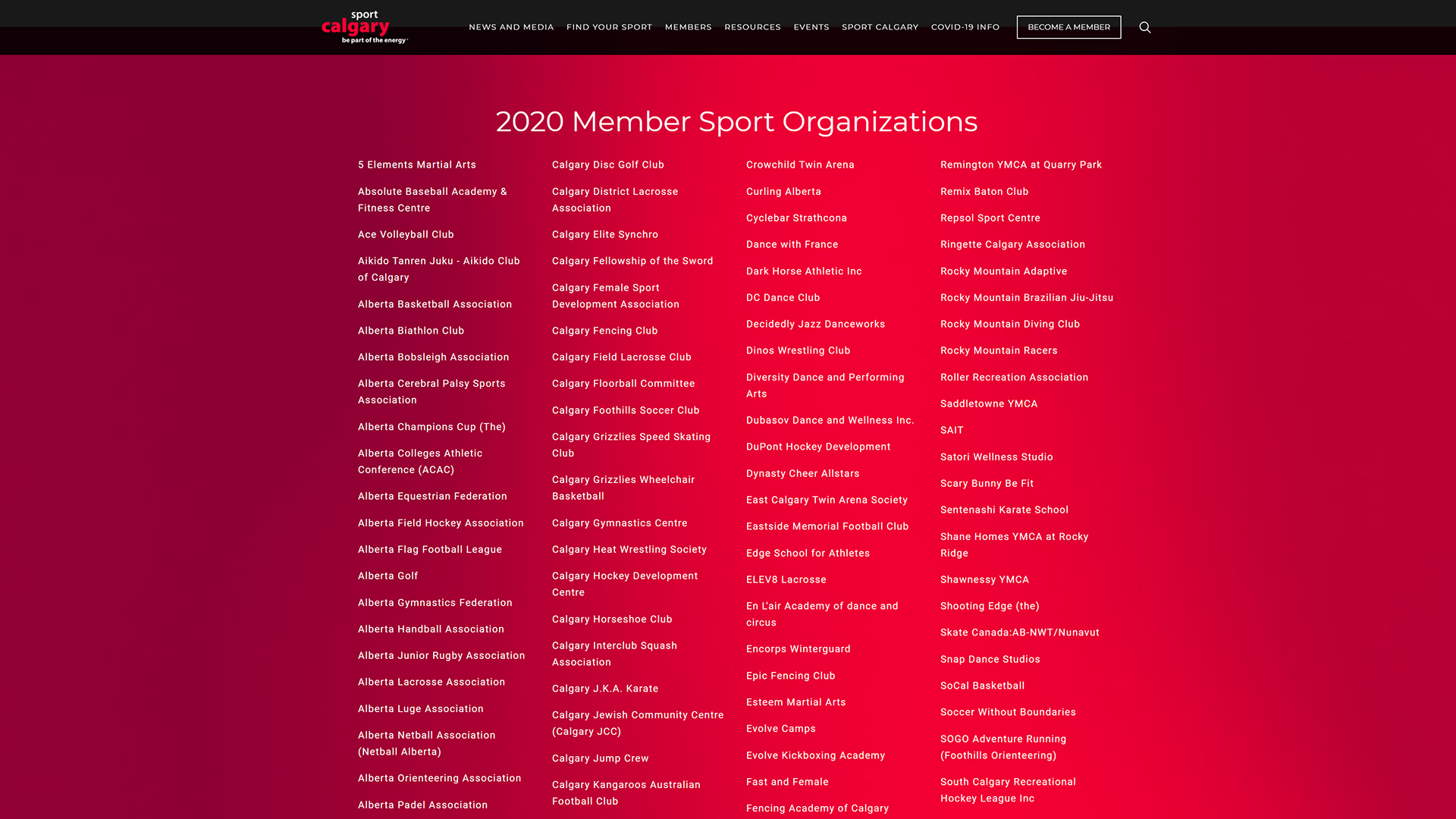
In light of the COVID pandemic, the 2020 edition of Sport Calgary's Annual Review saw the introduction of a digital format.
The Design
The Circle Pattern
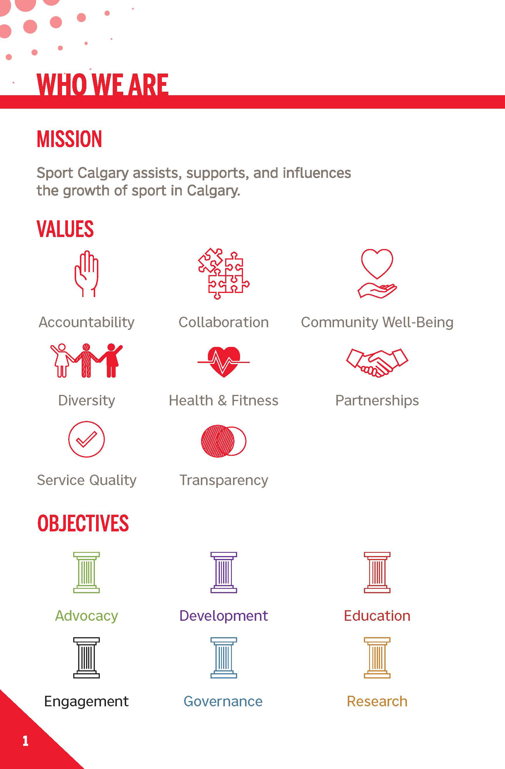
The circle is a very common shape you see in sport, especially in ball sports like soccer, volleyball, basketball, tennis, and so on. It was also a very simple pattern that depending on the size of the circle and the spacing can add depth and texture to a design.
Font Choices
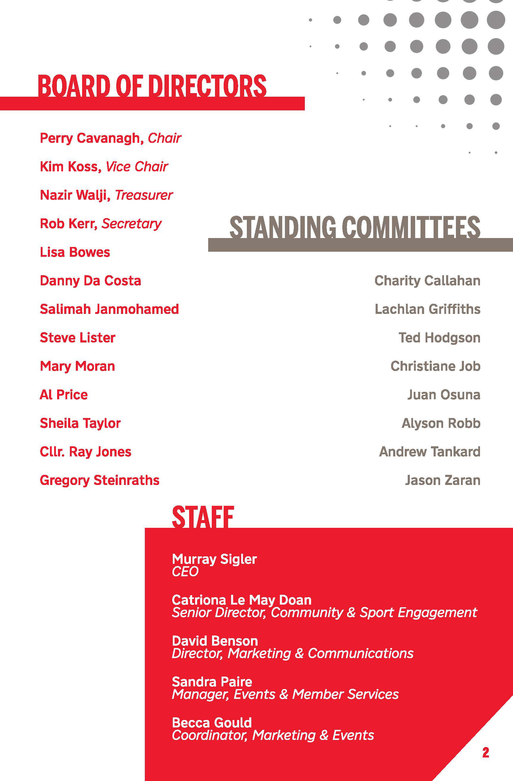
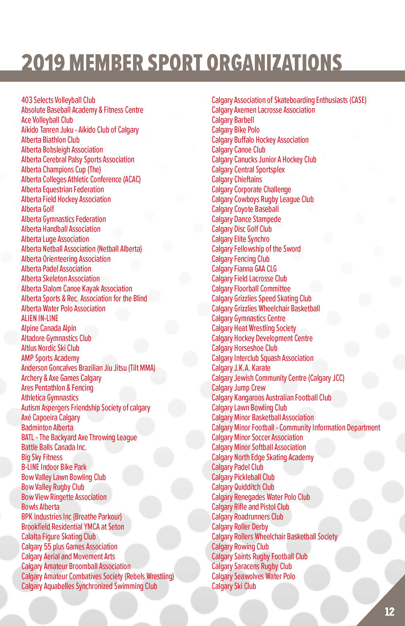
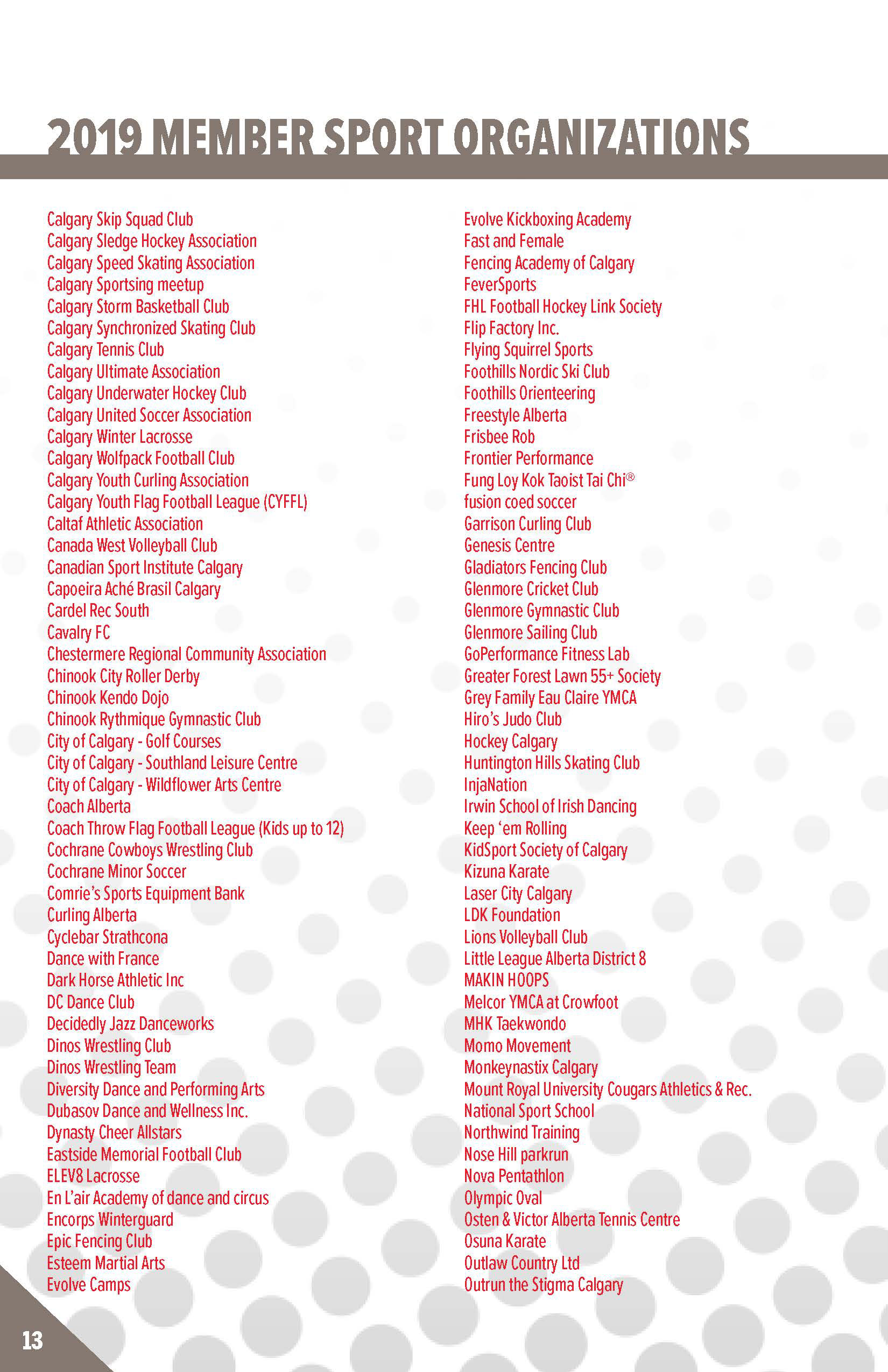
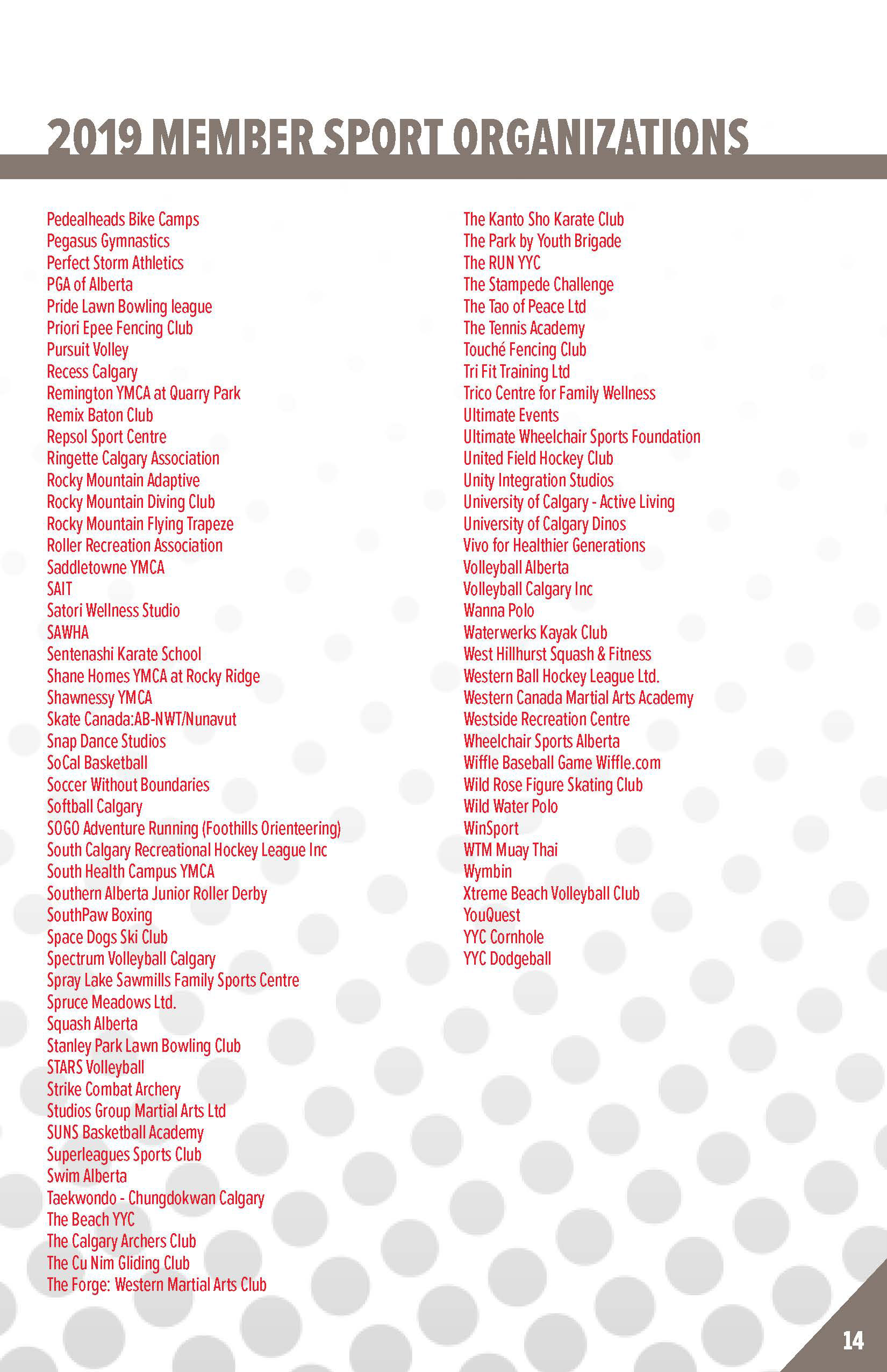
The font choices I went with were Benton Sans Condensed (2018) for the heading in order to save space as well as make the headings and sub-headings pop, especially for the member listings page on the last 2-3 pages of each edition. The look and feel also gives off a fun, but professional demeanour as sport is known to be an activity that people take part in for fun, but to also convey that Sport Calgary is a professional organization.
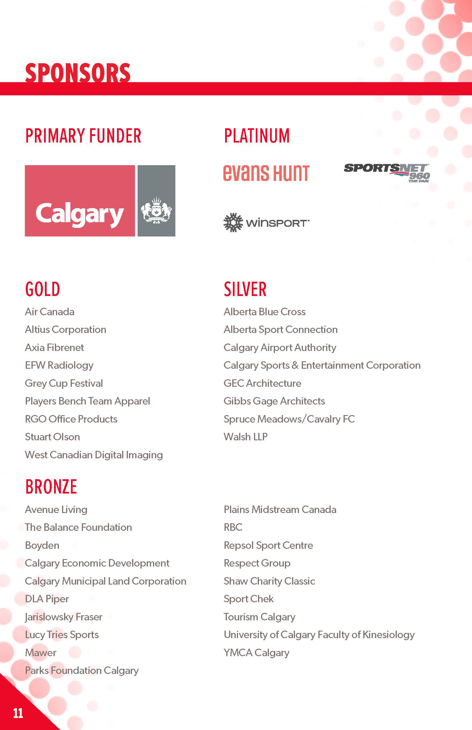
Colours
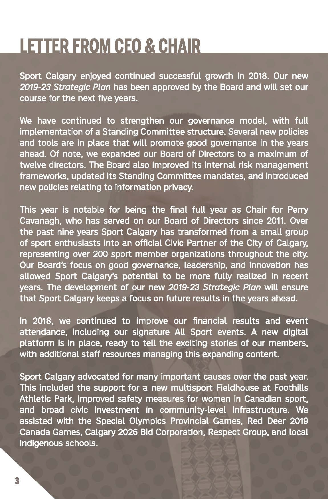
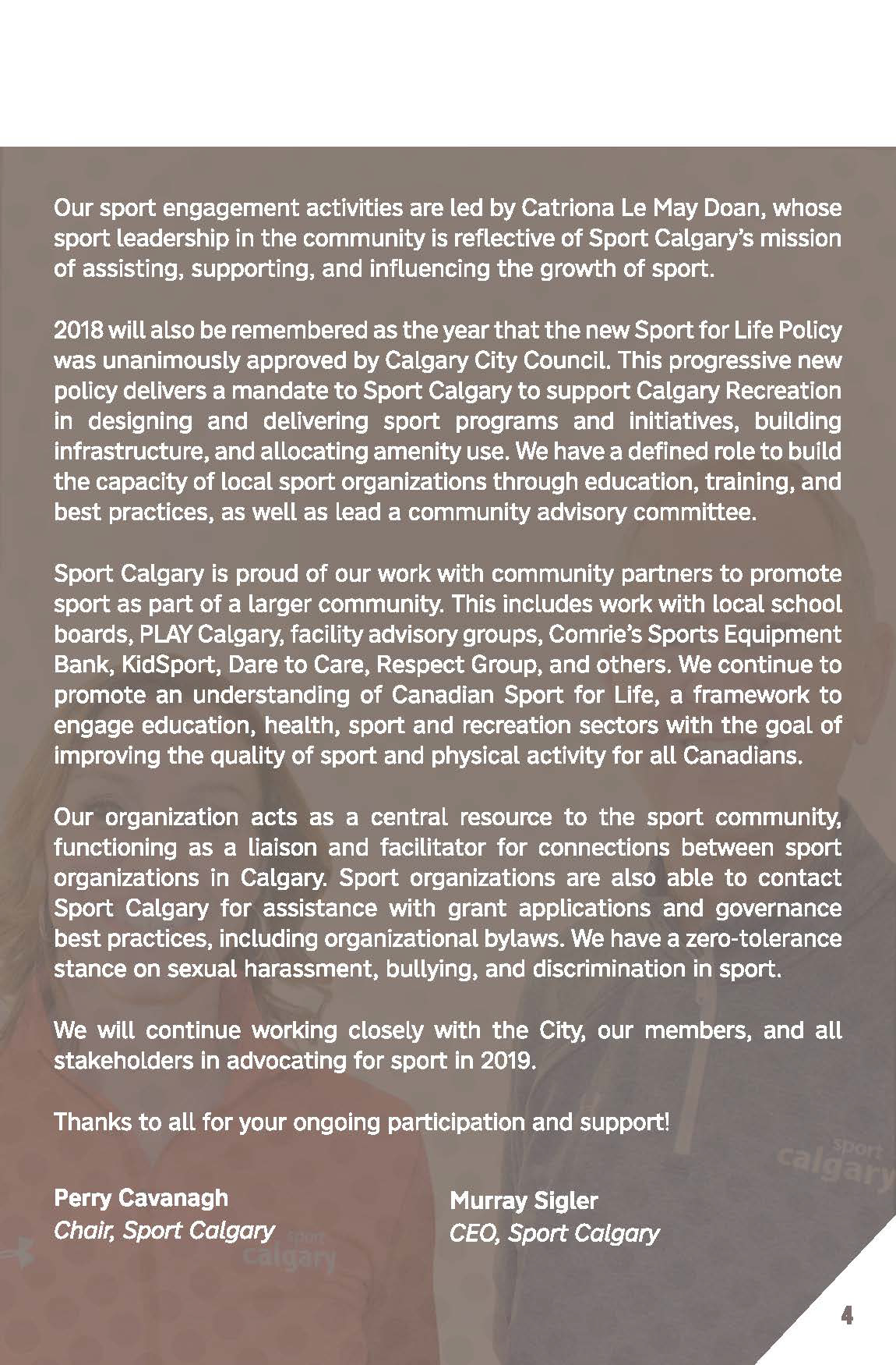
The primary colour was Sport Calgary's red, followed by their secondary grey colour that made up the logo. I alternated each section of the Annual Review from red and white to make each section pop and to add interest.
In the 2018 edition, I made the background grey instead of red as it was professional messaging from the Sport Calgary leadership (that being the Chair and CEO respectively).
Annual Review 2020
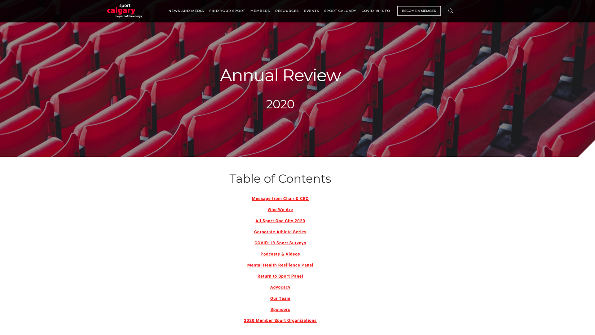
The Shift to Digital
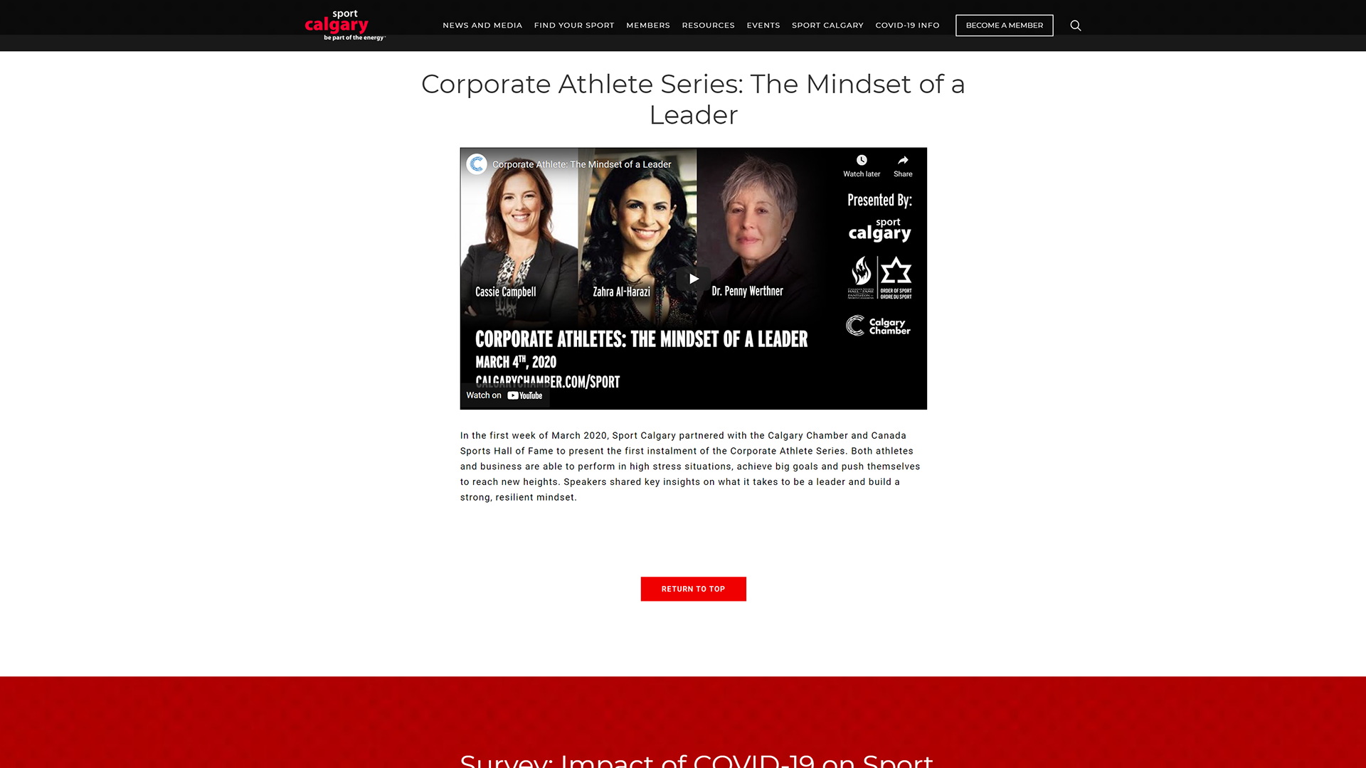
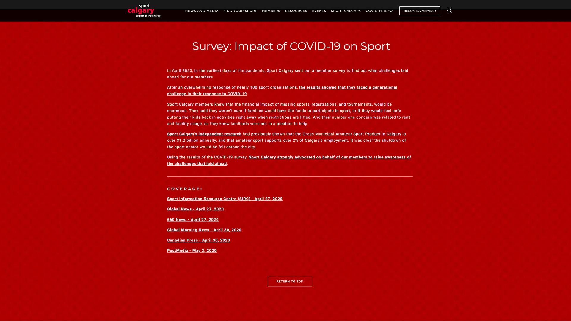
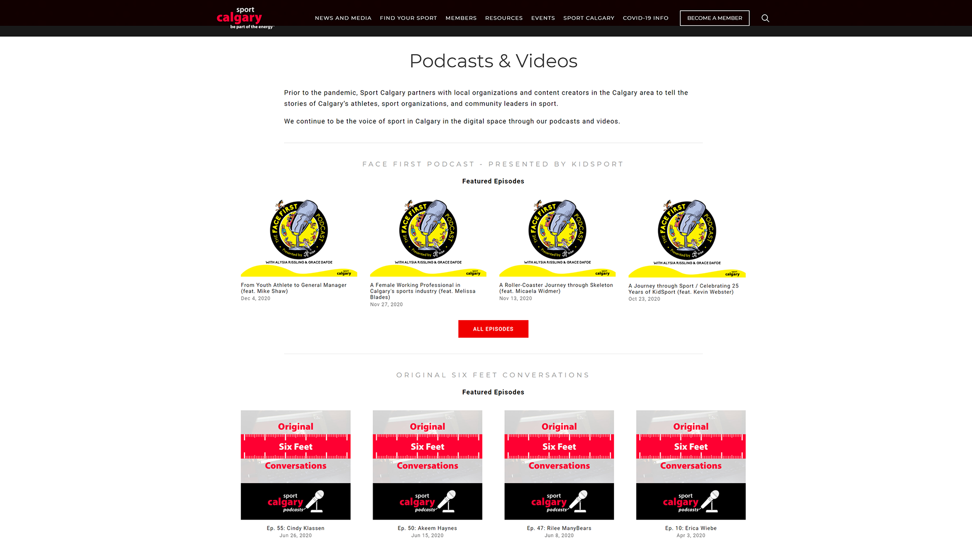
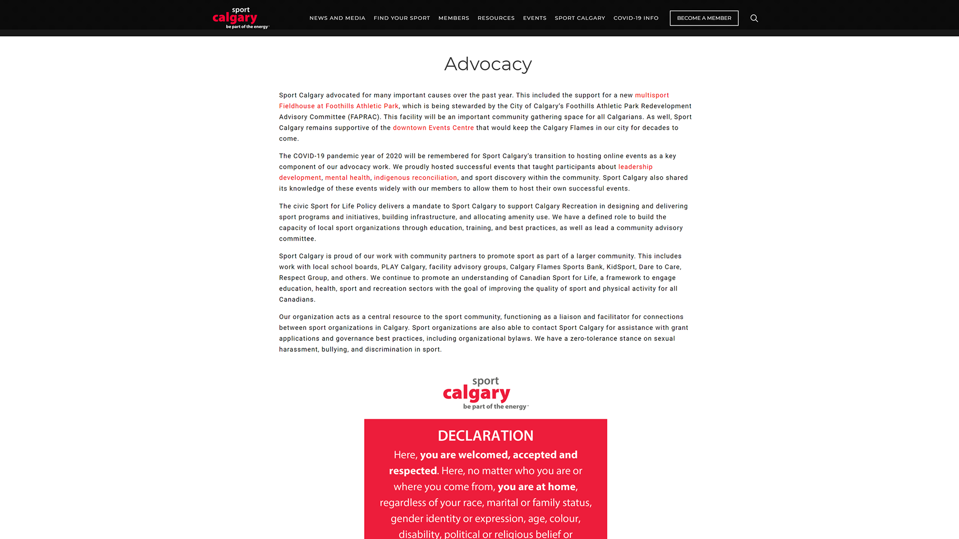
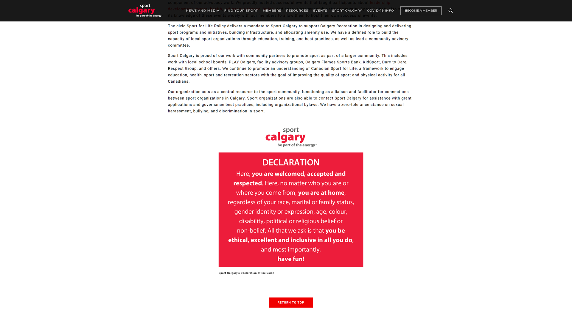
In March 2021, in light of the COVID pandemic, Sport Calgary shifted the format of its Annual Review to digital. As most of the content produced during that year was digital, Sport Calgary utilized the features of the Squarespace CMS, which is the hosting platform sportcalgary.ca utilizes.
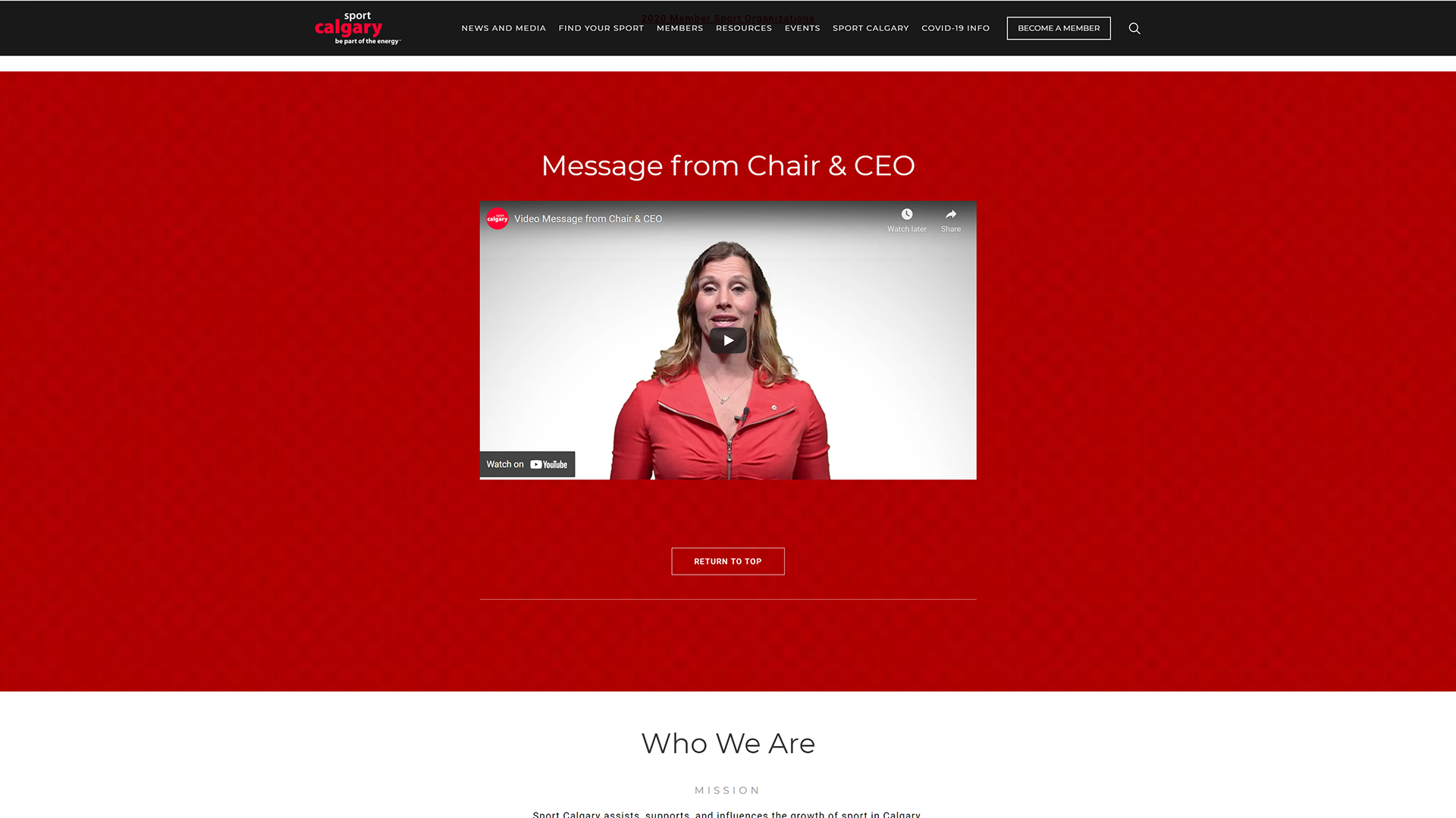
Feature blocks, such as video, summaries, and Image Galleries, were used to showcase the work Sport Calgary had done in the digital space in 2020.
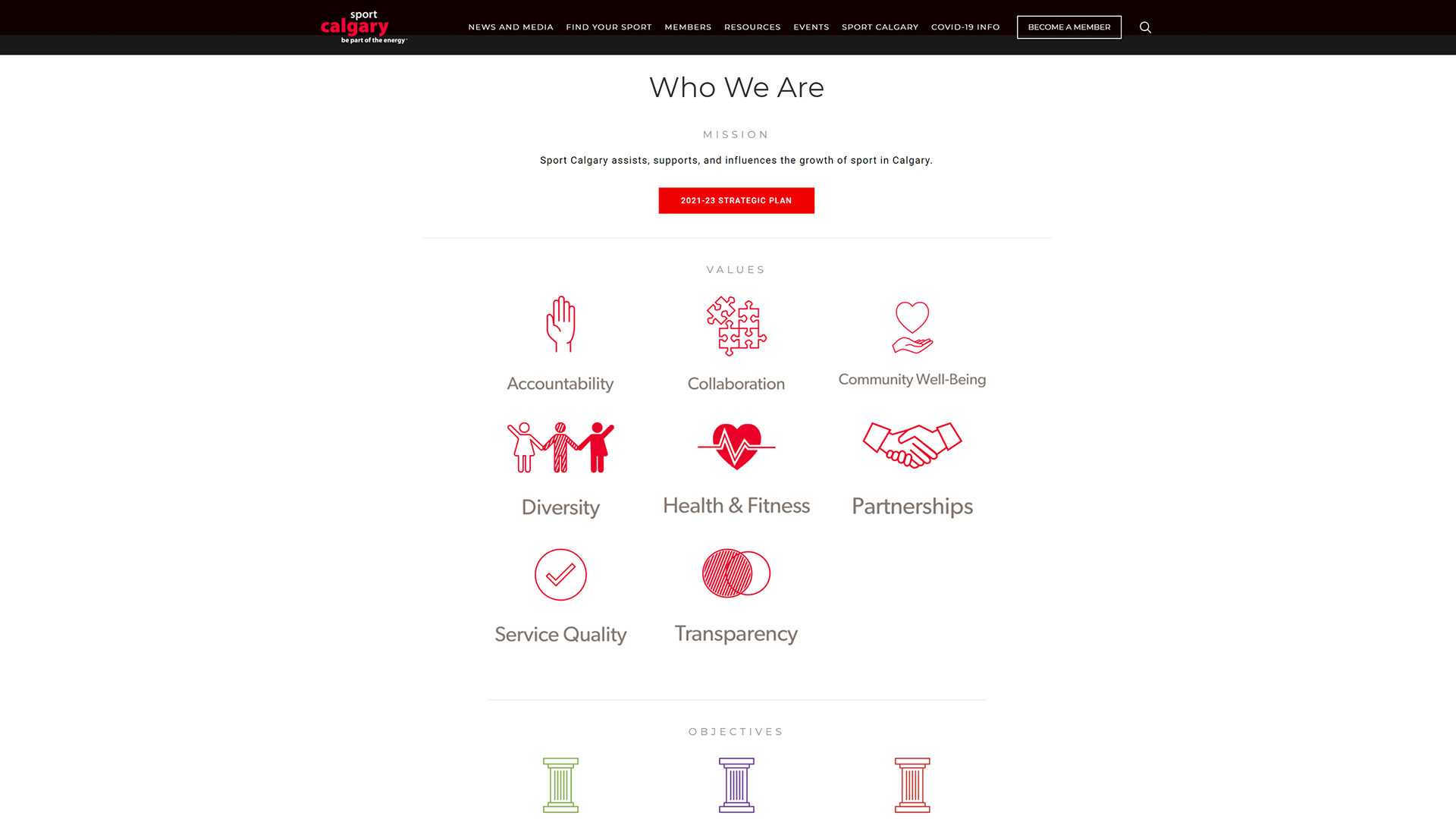
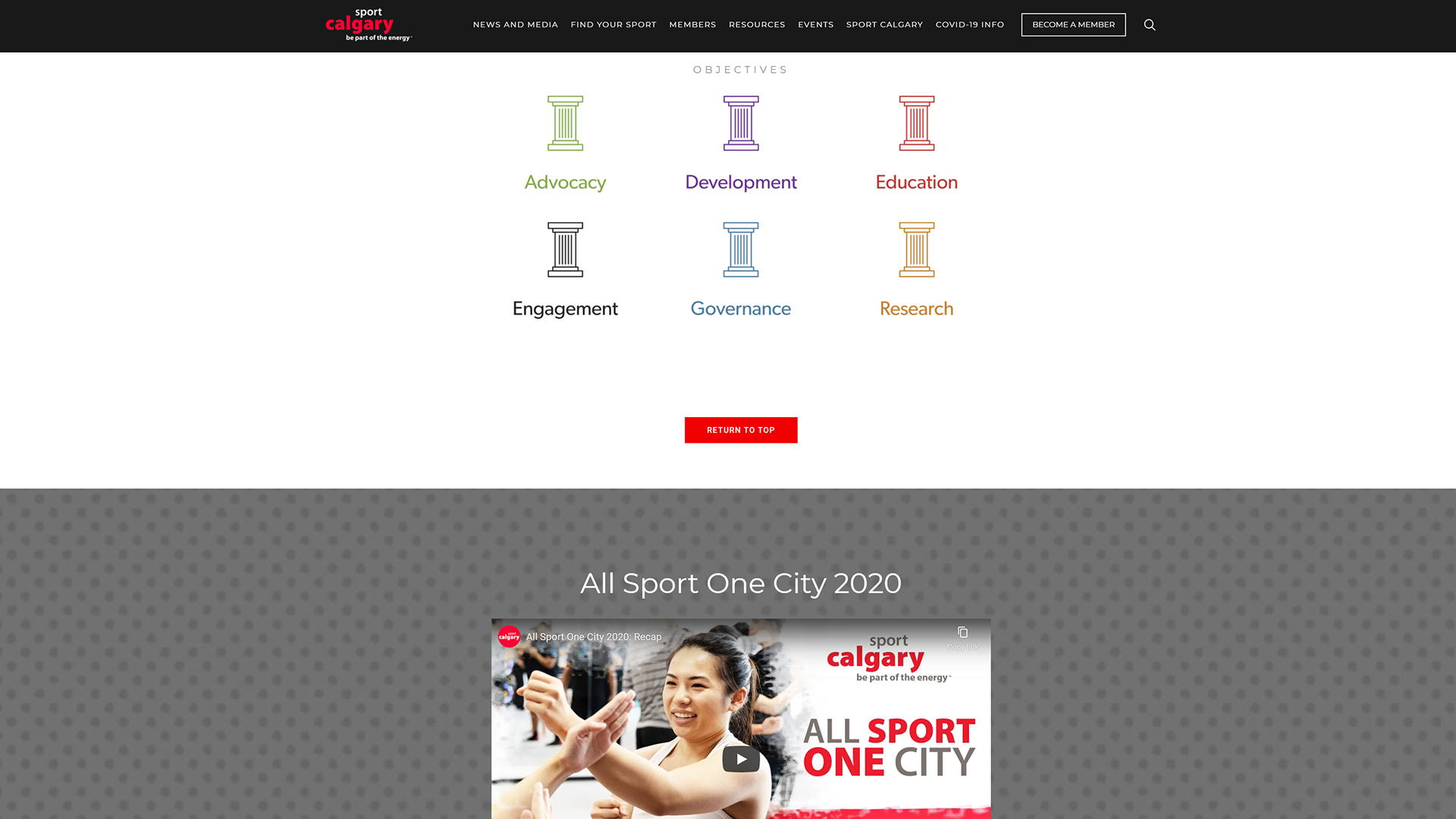
The font Montserrat and colours used were consistent to Sport Calgary's branding currently present on the website.
Some visual elements used in the printed editions that remained consistent, such as icons, were carried over into the digital space.
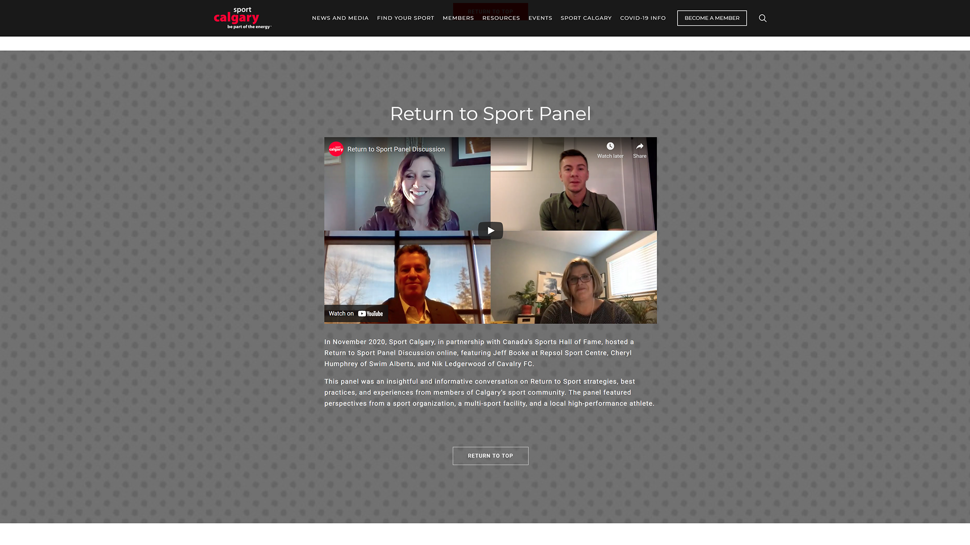
Recording the Message from Chair & CEO Video
The opportunity presented in the digital space was that the Chair & CEO message was recorded as a video, which a departure from the traditionally used written letter in the printed formats.
The video was recorded in April 2021 in a physically distant environment at the Sport Calgary office using a green screen as a backdrop.
Sport Calgary CEO Catriona Le May Doan and Chair Mary Moran were separately recorded.
The video you scrolled past is the final product.